Your Cart is Empty


A Full Colour Logo And The Simplified Version
Taking a Full Colour Logo and Making a Simplified Version
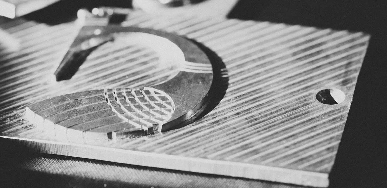
In order to create an impression in a cover or on a box, we make a metal die. To make this die we take a vector image (or very high resolution image) and create a photographic film positive (the opposite of a film negative).
What is transparent (clear) on the image is either chemically washed away or in the case of a CNC die, drilled out. What is covered by the dark, or black area of the film remains and from this is created a die plate or stamp.

We then attach the die plate to the hot plate of the stamping machine (above) and create either your emboss or foil stamp.
It is for this reason that full colour artwork or greyscale (B&W) artwork will not work as everything in the photo positive will be covered, there will be nothing left transparent and you'll get a black blob!
When printing colour you need 4 different dies or plates, one each for Cyan, Magenta, Yellow and Black. Even greyscale and black and white requires more than one die plate.
We are only making one die and that is why we need your artwork in a very simple all black and white format. It has to be positive reading, and what you want stamped must be in 100% black. It must be on a clear white or transparent background, (as that is the bit that is being either washed or drilled out).
This means that in some instances that we need a simplified version of a logo and nothing illustrates this better than a coat of arms.
Sample 1 - What we can't accept or use (because it's in full colour), is this below.
 Sample 2 - Even in Greyscale or shaded black & white, is of no use.

Sample 3. What has to be sent is a simplified version of the above, which is this below.
 As you can see from the above, there is no colour and no shades of grey. This is called a "Simplified" version of a logo and this is the version of what we need and what we can make your stamp or die out of.
So how do you go from example 1 or 2 and get to example 3? A good graphic designer will create a simplified version by re drawing your artwork or coat of arms and creating a simplified version. They MUST CREATE A VECTOR IMAGE of it as it can then be scaled bigger or smaller without losing definition.
Don't worry, once it's done once, it's finished artwork, and will not need to be re-done.
Thanks to the University of Birmingham for the use of their logo.