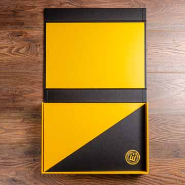
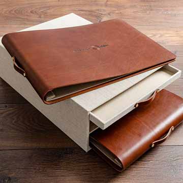
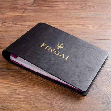
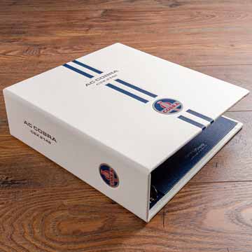
Your custom, personalised and individually handmade order will be ready for delivery in 3 - 4 weeks.
0

Your Cart is Empty

Shop For
  • Help & Information
  • Gallery
  • CREATIVES

  • Portfolio book inside portfolio box

    Portfolio books and boxes used by professional Photographers, Designers and Architects

  • BUSINESS

  • leather tender presentation proposal box and binder

    Presentation binders and boxes made by us and used by Companies and Corporations

  • HOSPITALITY

  • Bespoke leather guest book

    Products used in Restaurants, Boutique Hotels and on Super Yachts

  • VEHICLES

  • thumbnail custom vehicle history binder

    Bespoke binders and boxes for classic cars and motorcycles

  • June 18, 2019 11 min read

    This article first appeared in the Association of Photographers newsletter 23 May 2019 

    Getting a portfolio made is a large out lay and an investment, with many questions and options to consider.  What is certain is that you want the portfolio to house your work beautifully and for it to leave a long lasting impression.

    At this time of year final year students will be weighing up options for their first professional portfolio and as we all know it doesn’t end there!. Portfolios are always evolving, so much so that they are good way to look back and measure how your career has developed over the years.  We got in touch with commissioners and agents who offer their expertise and advise on what makes for a good portfolio.

    Photography Commissioners

    Lu Howlett (LH), Head of Art & Photographic at Iris Worldwide

    Daniel Moorey (DH) – Head of Photography & Illustration at adam&eveDDB

    What in your view makes for the perfect portfolio? 

    LH - A folio should be constantly evolving, taking new shape and breathing into new spaces.  The idea of a perfect portfolios makes me think of an artist with their feet up, sitting back waiting for the phone to ring.  The best folio is one that’s constantly reinventing, showcasing new work - personal & commissioned.  Think of it as, well, not an entire face-lift of course, but, just a little botox, it helps to keep those commissioners on their toes.  There’s no such thing as perfection.

    DM - The perfect portfolio depends to some degree on what work you want to get and what area you want to work in. From a classic advertising point of view I’d say some great personal work as the bulk of the book to show your own vision when left to your own devices to do what you want. At the end some amazing award winning ads in the form in which they originally ran with copy and logos on. This is tricky. Sometimes the design doesn’t look nice, sometimes the shot through no fault of your own might not look as good as you felt it could. Having ads though separates you out from someone that can go out into the creative wilderness and do their own thing to someone that can turn up to a shoot on a particular date, navigate 20 people all telling you to do something rubbish, make a client feel secure and convince them of the best location to use etc in order to create a small piece of magic rather than a small piece of shit. Even the fact that you have chosen a good ad to show would be an indication that you know what you are doing and have some judgement to at least spot a good ad! Similarily you don’t want a whole book of project based work that makes you look like an artist rather than a commercial photographer, the odd story can add weight but is possibly better placed in a separate area on your website or as a published book alongside your portfolio where relevant.

    The personal work should show you have a unique vision, it should look cohesive but with enough scope to provide interest and inspiration for people to work with you. It’s a working book not an art monograph (unfortunately). It’s amazingly exciting if someone has a style which you instantly recognise from seeing a single image but being realistic many people work in an area that is already inhabited by other photographers and often for good reason because that is where the work is be it lifestyle/sport/fashion. Not everyone needs to change the world visually but as a minimum there should be a small bit of uniqueness to your vision.

    Why a portfolio book rather than just a website or tablet? 

    LH - Anyone can view work online or social media, this means the artist has no control over how their work is being viewed, be it on a small device or poorly calibrated screen.  Having a physical folio enables the artist to share work as they see it in the real world.  It’s very important for a serious commissioner to see work that has been physically printed by the artist.  It also gives an artist an excuse to make an appointment to share a physical product.  Not only is this more enjoyable for the commissioner, it’s also more memorable than clicking on a link.

    DM - If you are making appointments most commissioners will have spent the day with their eyeballs super glued to their computer screen. Seeing real prints provides something different for their delight and makes your work more memorable. Seeing images on a tablet sometimes provides a slightly glossy, backlit, beautiful but banal world. There is also an obvious joy in the craft of a print. You should definitely take a tablet for your amazing film work which you obviously have loads of to back up your stills. Make sure the films are downloaded to the tablet already, don’t turn up to a meeting expecting wifi, in the age of insecurity getting a wifi code in big agencies can be like Mission Impossible.

    Preferences in size, format, numbers of images 

    LH - Size and format is in the eye of the beholder ;), it’s the artists personal preference.  Simply ensure it fits with the photographic or illustrative style & treatment - I’ve loved viewing A5 handmade scrapbooks with 35mm prints taped down with masking tape just as much as I’ve enjoyed soaking up glossy pages of A2 leather bound wonders.  Keep it personal and don’t overload the folio with much repetition.

    DM - I’d go between A4 and A3, leather bound, clean plastic sleeves, name embossed on the front, probably black, 30 ish images full bleed, maybe a white border. Clean and simple. No cards as they are bad for the environment.

    Pet hates and Pet likes?  (Immediate turn-offs)

    LH - DISLIKES: emails with paragraphs of copy and no imagery.  LIKES: Physical mailers that land on my desk, standout and make me smile.

    DM - Cards. Dirty portfolio sleeves. Multiple portfolios. Portfolios that come with white gloves. Dirty ipad screens. Portfolios with no name on the front. Portfolios with not enough images to really judge the work. I sound very fussy and slightly arrogant but seeing anyone’s work that they have taken time to produce is always a privilege and obviously should be treated with the greatest respect.


    Photography Agents

    Cathy Bennet (CB) from Vue Represents

    Lisa Pritchard (LP) from LPA (Lisa Pritchard Agency)

    Ian Potter (IP) from Miss Jones Agency

    What makes for a perfect portfolio? 

    CB -  A portfolio is constantly evolving, it will have moments of being perfect, but it should never rest on its laurels. It’s so important these days for photographers to move their work and portfolio forward. I represent photographers looking for commercial commissions, their books are often a balance of commissions, personal work with a focus on commissions and personal work that’s a reflection of their voice. Getting that balance right is the difficult task and to some extent a perfect portfolio will have that balance, along with a clear genre and voice that makes it distinctive against its competitors.

    LP -  Slick, individual presentation (of book and case); good branding evident - e.g name embossed on cover, title page or end page with photographers details; considered, tight edit with engaging but commercially relevant images, personal projects and commissioned work; perfect printing; high quality paper; an address folio tag and a pocket for your promos.

    IP - From an advertising and I suspect editorial perspective, folios need to be concise without being too brutally edited, and need to demonstrate a single voice. By which I mean it needs to feel as if one photographer is responsible for its content. This shouldn’t necessarily restrict subject matter, but too much flip-flopping between styles can confuse and result in the failure of the portfolio’s main purpose… to help you as an artist lodge firmly in the mind of a creative or commissioner. 

    What is your view on portfolio books? 

    CB - Portfolios aren't called out anything like they used to be. We all view imagery at such a fast pace these days, but there’s still a vital need for a physical portfolio. We show books at group portfolio meetings, creating an opportunity for commissioners to immerse themselves in the work for a moment longer than digital allows. This is the best exposure in my mind and can often lead to interest in a photographer’s work for a job that might not yet have a photographer in place. We would also expect photographers seeking representation to show a printed portfolio. 

    LP - If you mean as oppose to boxes of prints, those are my favourites definitely. Everything stays in one place then and makes it easier to view. There is much more chance of the viewer flicking through a couple of times with a book as oppose to a box of prints. You can also really play off the images against each other with a printed book - especially if it's printed double sided- if you are clever with the sequencing and juxtaposition. You can update them quite easily as well. If you mean should you have them, most definitely. It’s the most effective way to present work.

    IP - If you are serious about being in the mix then your folio book itself needs to be up there with the competition. While portfolios are not as crucial as they once were, creatives and clients still love to see the work up close and brilliantly realised - nothing beats a good print in my view, as handy and quick as an iPad is. The portfolio could be the initial key to your success, if the key is wonky or a bit rubbish, then it ain’t gonna be opening any doors!.

    What about portfolio/print boxes?

    CB - Print boxes can be tricky to manage, and they’re not the easiest way to show work in smaller offices. None of my photographers use print boxes, but they could work for a photographer that shows their own work. 

    LP - As I say not my fave, they can be a bit off a handful. More laborious looking through all the prints and they invariably get put back in in the wrong order or lost entirely. I’m aware that maybe the fine art world like to look at prints in a box, but they're not for me. They seem a bit precious, especially when they come with a pair of white gloves- which I’ve seen!.

    IP - I don’t mind print print boxes - but they soon get jumbled at viewings. It’s important the folio flows, you are telling a story, and sometimes that’s difficult with a box of loose prints.

    Pet hates - What would make you tell a photographer they need to get a new portfolio? 

    CB - A book that’s too big, A3 tends to work well. Outer boxes make portfolios much heavier and are another barrier to turning pages quickly. 

    LP - Cheap or tatty portfolio case. Different types of paper in one book. Pages trimmed to different sizes. Inconsistency in print quality, some pages faded as ink was running out. I saw all of these things in one book once!. 

    IP - Anything too shabby, or anything too over the top irks me. There was a craze in the 90’s for massive folios in cases in further cases in boxes with bells and whistles and special locks and foldy-over bits… no no no… !.

    Pet Loves -  When you first handle a portfolio, what makes you think “I’m looking forward to seeing this, or I’m looking forward to sending this out”. 

    CB - We are very proud to show our photographers work. When we take on a photographer we look for a cohesive style, that’s well edited and leaves you with a solid idea of the photographer’s taste. More often than not it comes down to would we be proud to show that work.

    LP - First impressions really count before you even start looking at the images. A beautifully crafted, bespoke portfolio will have your attention from the off. A neat and professional overall package, with a few extra touches to set it apart, is a sign to me of a professional photographer who will put that little bit extra into everything. Whether it's linen, leather or suede, I love it when a photographer has pushed the boat out a bit further and added their own stamp to a book, maybe with a punch of colour or a different fabric on the inside covers or the spine for example, or a clever logo embossed on the front.

    An appropriate amount of prints is also important, you can tell as soon as you see or pick a book up whether it's got too few or too many prints in it.

    IP - As above - if it looks like it is quality, thought about and has some individuality about it - then great.

    Page protectors/sleeves or images put directly into the folder?

    CB - To sleeve or not is very much a personal choice. Sleeves do allow a more manageable double-sided edit and that can work well for some work.

    LP - I’m not a big fan of acetate sleeves personally, I find it a bit irritating looking at things reflecting on the pages when you are trying to see the images. I’ve very rarely seen a print in a portfolio come back damaged as it doesn’t have page protectors. People are generally very respectful when handling the pages- although I did get a book come back from an agency with raspberry seeds on a couple of pages once, I guess the art buyer was eating their breakfast at the time!.

    IP - Either can work - acetate sleeved folios tend to be flicked through at a quicker pace, so I tend to make these a little longer. Raw print folios tend to be pondered over far more, so I keep these shorter or have multiple images on a page here and there to help with the pace. 

    In your view, what format rules to adhere to (size, number of images, printed double or single sided, anything else?)

    CB - Again, most of this comes down to personal choice and in keeping with the image style and sensibility. On average Photographer’s tend to choose an A3 size, either portrait or landscape. A well edited book of 30 images is more favourable to a 50-page book. Leave the viewer wanting more is the key.

    LP - I would say A3 or A3 plus is a good size. You should choose landscape or portrait format according to what suits your work.

    Around 40-50 images feels right to me, based on personal experience of both presenting portfolios to commissioners and what I like to see when considering taking new photographers on. People differ in opinion on the amount of pages an advertising portfolio should have in it, I read an article from an agent in the U.S once that it should be 20. I think this is ridiculous and I would be very frustrated if I'd booked a meeting with a photographer and they only showed me 20 images. I'd have to go on their website to see if they had shot anything else and to help me get a clearer picture of them.  I know one or two art buyers at the big advertising agencies that say they only like to see 30 images, but in the wider commercial industry , i.e branding agencies, design agencies, social media agencies etc, they definitely prefer to see more like 50 images, especially when you present a book with double sided prints. I assume this is because they are used to commissioning multiple images from one shoot, banks of images for a brand or images for a whole website for example, as oppose to just a campaign of 3- 5 images. 

    I do think double sided printing can give opportunities and options that single sided can’t, not least you can get away with including more images in it. But I do appreciate it's more difficult to change and can be more expensive. Investing in a printer to do it yourself and maybe even share with other photographers is one way to go that pays off in the long run. 

    Whatever you choose though, remember a portfolio is an important part of your marketing artillery and a worthwhile investment. Many commissioners will expect to see a printed portfolio at meetings, and it’s a brilliant way to really show off your work (and your professionalism) when executed well!. 

    IP - Nothing too big, Anything over A3+ can make it difficult for all concerned, the people carrying it there (me) and the people struggling to find a place to put it when looking through. Anything too piddly screams 'tight-arse’. Pagination - totally depends on the subject matter - ours are normally around the 30 to 40 printed page mark, some with multiple images, some no.

    Hartnack & Co Portfolio Books can be found here

    The original article can be found here